Htm Comes To Nike Id
In a first for HTM, the circle of creativity has been jammed open to allow a fourth collaborator to join – you! HTM is headed to Nike iD for an incredibly limited appearance, bringing with it a fresh approach to sneaker customisation inspired by the three distinct design nuances of Hiroshi Fujiwara, Tinker Hatfield and Mark Parker. We caught up with J. J. Griffin, creative director of Nike iD, to learn about how he is curating this unique opportunity.
What’s HTM Nike iD all about?
We really wanted to inspire folks to see exactly how Hiroshi, Tinker and Mark actually create their own colour palettes and provide others with a platform to produce their own Air Max through these same lenses and inspirations. Each of the team represents a different philosophy, resulting in amazingly different design expressions from each one of them. That’s the beauty of HTM.
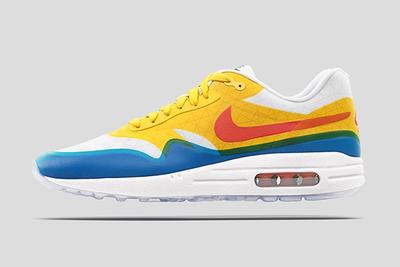
How did you approach the Hiroshi options for iD? The has arguably the most potential for colour.
Correct. When it comes to Hiroshi, he does things very simple, but he does them with a design edge that evokes an emotion at the same time. He chose the Air Max 95, which has traditionally been a huge silhouette in Japan. We wanted to give him a palette through which he would be able to apply his ‘editor’ mindset. His design process is ‘less is more’, so we picked a lot of really purist colours for him to bring this to life but also allow it to be juxtaposed against the finer details.
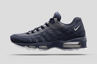
With those colours there must be a reference in Tinker’s ?
Tinker thinks more like an architect. We took inspiration directly from the Pompidou Centre in Paris, which inspired Tinker in his design of the original Air Max 1. Each of the coloured pipes at the Pompidou Centre has a certain function. Green is for waste, blue is for air-conditioning and red is for heat. They designed the building so that people would see the functionality. The parallel is visible air – you can literaly see the functionality. We wanted the palette to reflect the colours they used on the building, but make them translucent so it’s as if you’re seeing through to the engineering that actually provides the structure of the shoe.
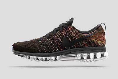
I guess there was some pressure on you with Mark’s shoe - he is the CEO!
His concept certainly wasn’t easy to bring to life, but you can’t exactly tell the CEO ‘nahhh’ when he approaches you with an idea! [Laughs] Mark is obviously a super-creative person. He really leans to this idea of how nature and colour and finishes and forms start to come together. So we took some of our latest technology like iridescent, transitional gradients and pixelation to capture the look of brightly coloured insects. We took the and applied an actual gradient over the top of the Flyknit, so it looks like the Flyknit is fading from black to a full multicolour. It was probably the most difficult stage in the whole process, but we are doing something with Flyknit that we’ve never done before as a brand, by combining printing technology together with textile technology through the knit. This is a really exciting opportunity for Air Max customisation.
The HTM Nike iD options are available right now for a limited time. Head on over to and get creating!