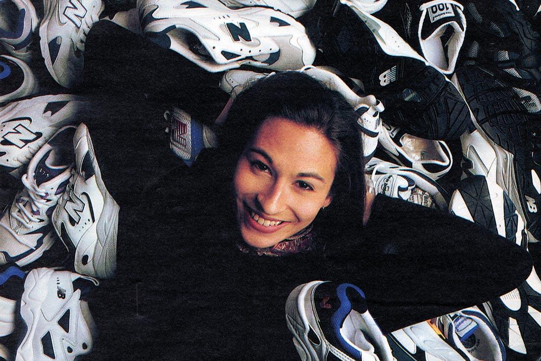
Interview: Stephanie Howard and the Missing NB850 Logo
Getting your metaphorical foot in the door is one thing, but designing the runner on that foot as a rookie is incalculably tougher! When Stephanie Howard joined New Balance straight outta design college in 1994, she officially became the youngest member of the creative team.
One of the first briefs that lobbed on her desk was the 850 runner. With ABZORB, C-CAP and the Graphite Rollbar pronation device in the heels, Howard’s design – on paper at least – sounded like a standard issue New Balance tech sheet.
But the provocative design quickly became infamous for something that didn’t even appear on the shoe. (Here’s a clue – it starts with the letter ‘N’.) If things still aren’t apparent yet, check out the oh-so traditional 999 and 1600 from the 1997 catalogue as greyclad comparisons. As the 90s revival sweeps the sneaker game, we’re chalking up the 850’s impending return as yet another glorious win for the oddball brigade. Who better to talk us through the moment than Stephanie Howard?
Do you still always look down at foot level?
Definitely not as much as I used to! [laughs] It was hard to shake that feet-first look, but eventually I did when I left the sneaker industry to work in consumer goods. I still do a little footwear design, so I have kept my eye in over the years.
Let’s go back in the time machine. How did you end up at New Balance?
I graduated with a degree in industrial design and was looking for work in Boston. I knew Brian Keating, who was an alumni from my school and a New Balance designer, so the timing was definitely on my side. Funnily enough, he designed the 750 – which preceded the 850 that I ended up designing – so I should definitely give a shout out to him!
Do you remember walking in the front door that first day?
I think I was equally excited and nervous. We didn’t learn about footwear design at school, as it was never part of the curriculum. I was lucky because the NB team was small and a few designers were amazing mentors who were beyond generous with the time they spent educating me. But at least I knew that I knew nothing, so that was something!
It’s interesting looking at your workspace in 1997. Is ‘basic’ the right word?
Yeah, basic is the right word. The funny thing is that photo was taken a few years into my NB career and that desk was way more extravagant than the first one I sat at. We didn’t have our own individual computers in 1997, as almost everything was done by hand. Nowadays, everybody uses laptops and many designers don’t even use markers anymore. I know I’ve mostly retired mine because I do all my sketching on a tablet.
As you mentioned, your 850 design was an evolution of the 750, but you went way further than just updating the panels and materials.
I don’t remember the exact brief, but back then we listed all the performance criteria that runners needed then we just started sketching. The design team was really new to the company in 1995 and we all really wanted to push the envelope in terms of materials and concepts. New manufacturing techniques were changing things very quickly and creative freedom was a really powerful motivating force.
The upper of the 850 was definitely a radical departure, aesthetically speaking, but the process of how that happened was quite organic. I could see that running shoes were being worn outside of the sport and trending towards fashion, so it was definitely in my mind to expand the 850’s looks beyond pure performance.
‘Minimalism is definitely close to my heart. I think that simplicity and a deep consideration for what is – and what is not – required is super important. But the human need for self-expression is a powerful force that can’t be denied. Sometimes our state of mind requires much more than basic components when we’re all trying to tell our individual stories. That’s where the fun comes into everything.’
Let’s talk about what isn’t on the 850. You managed to wipe the big ’N’ totally off the map, which I suspect a lot of New Balance designers must have dreamed of doing over the years.
Yeah, I think so. I’ve been delving back into my memory to try and figure out how strategic the logo plan was. I remember feeling creatively restricted for some reason and that ‘N’ logo was really bugging me!
I started doing the lateral sketch to put everything in perspective and get a solid feel for the look of the 850. Somehow that process made me take the logo right off and that meant I could be more experimental with the layering and panels. The product team liked the concept drawings so we put a strategy behind it before I talked to Jim Davis, the owner of New Balance.
It must have been interesting telling Jim you’ve ditched his ‘N’ logo.
Yeah it definitely was, but in my mind all I was doing was presenting a third logo to the mix. We already had the ‘solid N’ logo and the ‘flying NB’ logo. I was proposing a ‘Flying N’ logo on the heel of the 850. It was a mix between our existing logos and it lightened up the N, so that when it moved to a smaller space it wouldn’t fight the aesthetic flow. That all made sense to me because it fit within the recognised structure of New Balance logos at the time.
I can imagine some of the old heads thinking, ‘Let’s put the young kid out there and test out Jim while we just kick back and see what happens.’
Maybe! [laughs] But I think everybody jumped on board because it freed all of us up to try new ideas. My manager at the time recommended I put a case study together of brands that had evolved their logos, and that laid the foundation for the detailed discussions. I remember feeling pretty confident because he was definitely an independent thinker. I was fortunate that he was open to the concept.
One other 850 memory was that a year or two later, all the retro sneaker patterns started coming back and suddenly there was a strong desire for big logos and simple style. I remember thinking that I may have made a mistake because the no-logo trend had already moved on. In the end, it may or may not have been the right style choice at the time, but as designers we all really enjoyed having the creative freedom the 850 inspired. And it did work! The 850 was a really successful product so yeah, it was the right idea for the right time!
In the 1997 catalogue, the 850 was billed as a ‘stability’ runner but it looks a lot like a cross trainer that’d be right at home in the gym and on the tennis court. Thoughts?
Yeah, you’re right. It was definitely designed as a purebred runner and because it has Rollbar technology it was also labelled as a stability shoe for pronating runners. The colour scheme was of its time I guess. Like a lot of running shoes in 1997, there was tons of white leather mixed with mesh. But New Balance definitely had a lot of cross training success, so I’m sure that influenced my design choices as well.
Did the 850 make it through a few different colour schemes?
I’m pretty sure there was one colour for men and a separate colour for women.
I can imagine a trail version. Just add a knobbly sole, some beige suede and a few colour pops and it would have killed the hiking circuit.
I totally agree. But if you think about the timing, I think New Balance only came out with their first proper trail runner the following season, though we did have hiking products and outdoor shoes already in the range in 1997.
The Rollbar is a serious New Balance nerd thing. How did you feel about it?
Well actually, in this case, because I used the existing 750 sole, I can’t take credit for the design, although I did contribute some crazy ideas in a few other shoe designs. Since I was new to footwear design and didn’t yet have a biomechanics background, the experts told me that it worked and I just took their word for it. I guess it is a pretty geeked-out tech feature but that’s what we had to work with in 1997.
The 850 was your third official New Balance design. What were the first two?
You’re right! I’ve been doing some searching on the Internet to see if I could find the other two, but they’re not showing up yet.
The first was a women’s version of the 999 runner that was domestically manufactured. I remember the New Balance pattern maker did not like anybody challenging how things were made! I don’t recall being super happy with how it turned out to be honest but it did have some of that classic 90s look to it.,
I also did the 705 running shoe. If you Google that it shows a shoe from the 2000s and that is not my design. It also had a little cross training influence but it has the big N in the centre, so it looks very different to the 850.
Did you keep a maternal eye on the 850 after it reached the stores? Is that process sort of like having a baby then giving it up for adoption straight afterwards?
That’s actually a pretty good analysis of how it works. I think about this a lot because it happens every time I design anything, and I wonder if others also go through this process. I’m guessing they do.
Designing a shoe takes at least a year and a half and if there’s some innovation required that can be even longer. I still remember when the 850 came out. The team was really excited about its success. The way it worked at New Balance, if we knew the product was solid, we were already designing the next version. If my memory serves me correct, I was already working on the 851 when the 850 debuted.
Did that success give you more power?
Of course you have to earn respect as a designer and that’s true everywhere. Wherever you go, there’s a sort of testing period. I remember thinking that the 850 gave me a little bit of credibility and I was really happy about that because a lot of unique changes happened in that product that were used to develop more interesting product lines which is pretty cool.
Streetwear designers are obsessed with 90s style at the moment. Have you thought much about this rolling cycle? Five years ago you couldn’t have given away some of these 90s-looking shoes, then all of a sudden they have come into their own.
Yeah, I have been thinking about this a lot. I believe that all people are individually creative and they know intuitively when they’re bored. Since there has been a lot of simple and clean design lately – which I love and is a timeless approach – there’s always room for that counter movement. Designs from the 90s are full of busy, wavy, overlapping patterns and that looks a lot fresher right now than all the simple stuff. I don’t know that I can explain exactly why it’s happening now but I do think there’s a bit of boredom and a need for individual self expression happening.
I’ve always said minimalism is overrated. [laughs] As a designer, you must love the periods where maximalism rules.
Yeah, well, that’s an interesting thought, because minimalism is definitely close to my heart. I think that simplicity and a deep consideration for what is – and what is not – required is super important. But the human need for self-expression is a powerful force that can’t be denied. Sometimes our state of mind requires much more than basic components when we’re all trying to tell our individual stories. That’s where the fun comes into everything.
Well said! And finally, what are you doing these days?
In my consultancy I work with authentic brands and focus on innovation. A lot of that includes different ways of manufacturing materials, as well as sustainability. My consultancy is called ‘How and Why’ and that name is derived from my mission to bridge the gap between what is and what could be. To explain that idea further, human values and cultural shifts drive all of our insights, meaning random products should never be designed without a how and why something should exist. So I try to define design in a way that makes it more purposeful. I’m also part of a new footwear startup. Outside of that I also have a new passion which is to solve the disconnect between food and health. That’s far from my usual work but since all design is really problem solving, it’s an area that definitely needs insight. Thanks for your time. Thanks for taking me back to 1996. I love that the New Balance 850 is returning 20 years after I designed it. The 1990s was such a fun roller-coaster ride!
This interview was originally published in Sneaker Freaker Issue 42. You can get your copy HERE.