Grey Matters: Steph Morris on Her NB574 Illustration
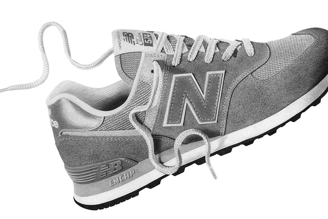
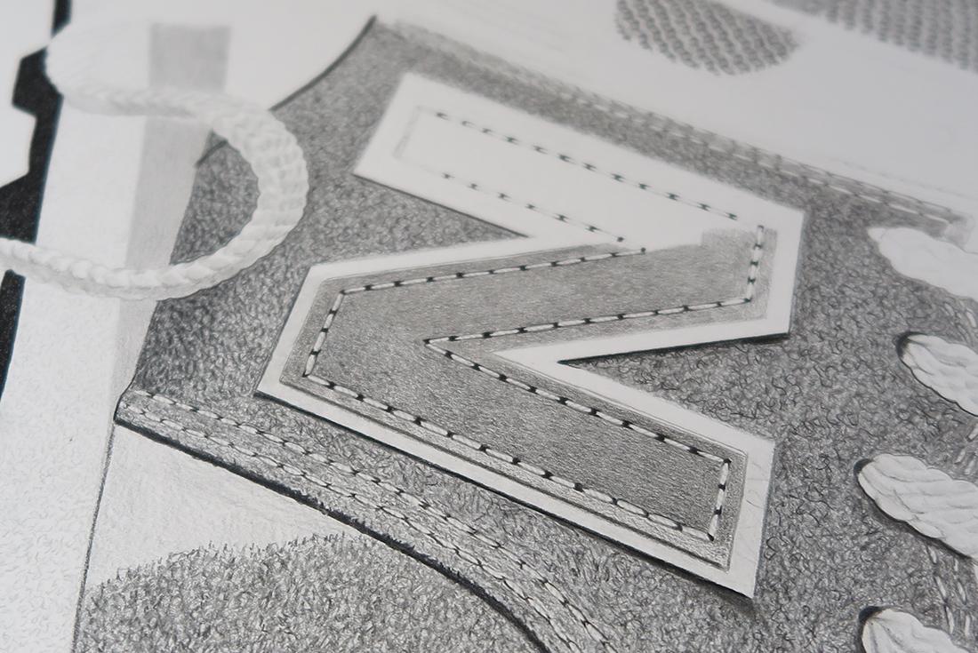
You’d be forgiven for thinking Steph Morris’ art was the result of pro-level Photoshop retouching, but her mind-bendingly detailed illustrations are lovingly crafted with Faber Castell greyleads. If there was one sneaker in the world born for Steph’s sketchbook, it’s the 574 — New Balance’s best-selling shoe of all time — in iconic grey-on-grey, of course. Steph was able to pencil in some time to chat with us about her creative process and the magnetic allure of graphite greyscale.
Artists generally put something of themselves in their work. What do your illustrations reveal about Steph Morris?
Introverted, perfectionist and hungry. I guess those characteristics suit what I do down to a T. I’m happiest when I’m alone in my studio, zoned into a crime podcast and drawing. The intricate detail of what I do allows me to get lost in my work and wonder where the past eight hours went. In those moments I know that there’s nothing else on earth I’d rather be doing every day.
Is there a difference between an artist and an illustrator? Do you fall in the grey area between the two?
That’s a great question and until a few months ago I would have struggled to answer it. I had a meeting with a very experienced illustration agent late last year and it changed everything for me. To get in with an agent I was told to consider drawing landscapes, animals, or even maps. My current body of work didn't tell stories, create characters or explore with style; I was described as ‘a niche within a niche’ and the agent was surprised I was making money. I had my answer. I walked away from that meeting with a newfound perspective, revelling in the idea of breaking rules as an artist. To me, artists have the freedom to explore concepts and ideas, whereas an illustrator tells strong visual stories. I don't think about where I lie on the spectrum anymore, I’m just glad I’m doing things my way.
How did you actually learn to draw like this? Did you go to art school or are you self-taught?
I studied art at GCSE level here in the UK, but for the most part I taught myself. I studied graphic design at uni but never really enjoyed it (and wasn't very good at it!). It was only when on the verge of dropping out that I switched to illustration. I immediately felt more connected to the work I was doing, and it turned everything around just before I graduated. ,You don’t need formal training to be creative, you just need the dedication to improve.
You’ve dabbled with colour, but your trademark is simple grey pencil. What was the process that led you to focus on working in such a simple yet complex way?
My process of working in layers and blending suits pencil perfectly, and I think that if I were to work in another medium such as paints or pen the whole tone of what I do would change. I like that things can smudge and that your hands get black working with graphite. Even though it’s such a simple tool to use, the more you understand about pencil, the more complex and refined your work becomes.
All we remember from high school is the old HB in a 3B. How many different pencils do you use? Are you loyal to one brand?
You can’t go wrong with a trusty HB! I’ve used Faber Castell 9000s since I started drawing. They’re not fancy or expensive, but I’ve just always used them. I’ve got a whole box of pencils ranging from 6H - 8B. Each number offers a different tone and stroke so getting used to each can take time. I think the key is knowing how to blend and build up layers, but once you master that, everything falls into place. I also use carbon pencils and coloured Polychromos, which are a little more complex.
The ultra-detail in the stitching and the texture of materials you depict in your work is amazing. From a practical point of view, how do you zero in on those micro details?Is it all about technique or more about understanding the object itself?
I think just knowing the basics of structure and texture helps me out a lot. Say I’m drawing stitching, for example, not all stitching looks the same. Some of the thread can be heavy and bulky, some is hardly even noticeable, but it’s just as important. I always take a step back from my work every few hours just to see how it’s coming together.
Colour is so crucial with sneaker design, but your work removes that element completely. You’ve obviously thought about this aspect quite a bit. What are your thoughts on staying true to the grey palette?
I like the simplicity of pencil and it’s interesting to see if I can recreate an iconic shoe with all colour stripped back completely. That was a challenge, and I think I achieved it pretty well, but I will be using colour in my work this year so stay tuned for that.
You shared a ‘performance review’ of your work showing 2016 vs 2017 and the difference was incredible. What did you make of that process?
I was pretty blown away. I get so absorbed in my work that I don’t always get chance to take a step back and observe with fresh eyes. So when I did, I was pleased to see the progression. I definitely felt that 2017 was all about honing my skills and really stepping up a level. I’m a harsh critic and sometimes I can be quite hard on myself, but I think without that I wouldn't have progressed nearly half as much as I have.
Tell us about the New Balance 574 piece you’ve created.
I loved the whole process from start to finish. When I was approached to do this project, I was really excited; New Balance has always resonated with me. I love the mono palette on this model and even straight out of the box they are so comfortable on-foot. After spending so many hours studying the details of this shoe I appreciate it even more; the balance of the tonal grey, the sleek woven mesh paired with the hairy suede – they work so well together. It was a blast from start to finish!
The 574 is available from New Balance online and in-store.
Photography by Dom Fleming.